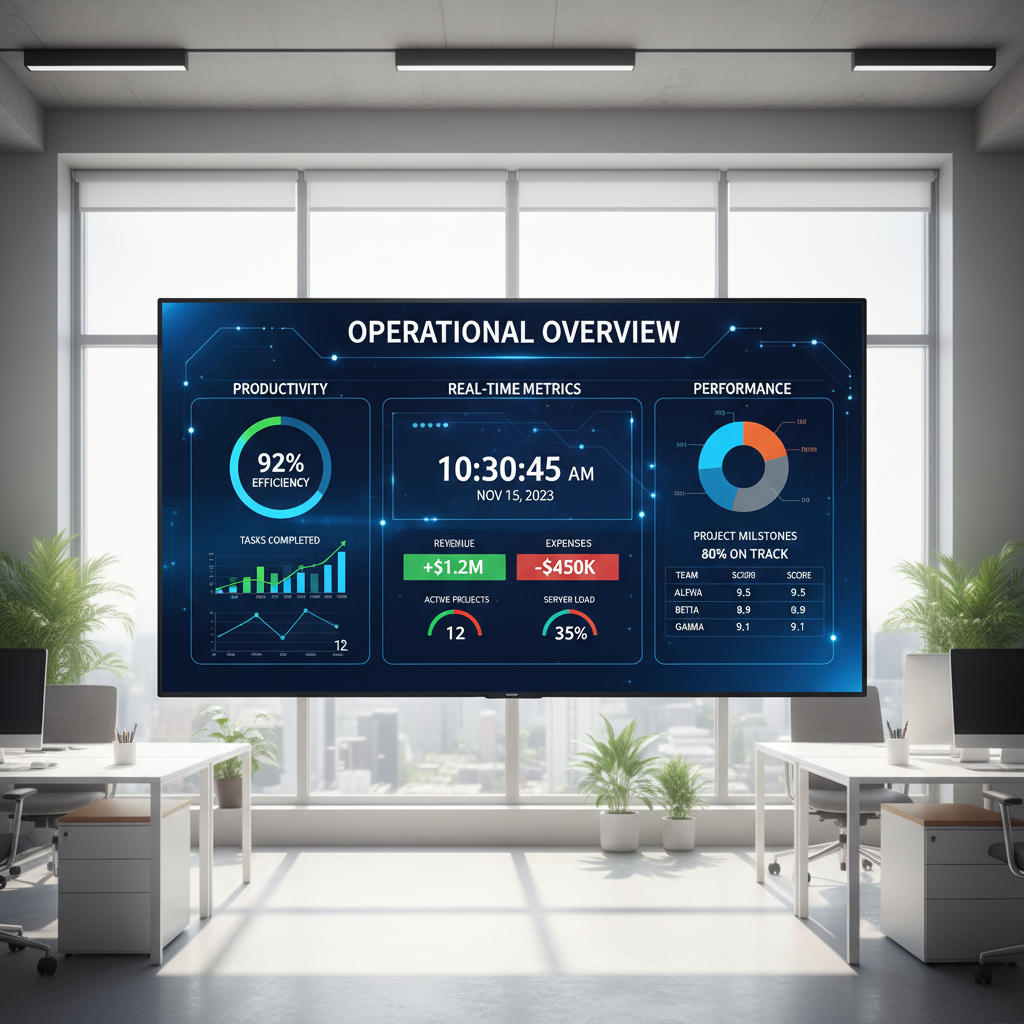
Building a daily performance dashboard for small business involves connecting various data sources to a visualization platform through automated data pipelines. This setup allows owners to monitor key metrics in real time while reducing manual entry; providing a streamlined way to track growth and operational efficiency every day.
Running a growing business without a daily performance dashboard is like flying a plane through fog without instruments. Many founders find themselves trapped in spreadsheet hell, where manual data entry leads to human error and delayed decision making. In a fast paced environment, relying on yesterday's fragmented numbers is a liability that limits your ability to scale operations efficiently. This article provides a technical roadmap to reclaim your time and clarity through automated data flows. We will explore how to audit your existing KPIs, implement AI tools for data cleaning, and choose a visualization layer that actually drives action. Additionally, we will discuss how integrating offshore expertise ensures your data pipeline remains robust, allowing you to focus on the strategic growth of your Toronto based enterprise.
The High Cost of Spreadsheet Hell for Growing Businesses

For many business owners in Toronto, Monday morning does not start with strategy; it starts with manual data entry. You likely spend the first few hours of your week exporting CSV files from your CRM, copying rows from accounting software, and wrestling with Google Sheets formulas. This is the Spreadsheet Trap. It creates a cycle where talented founders and managers are relegated to data clerks, spending high value time on low value tasks.
The cost of this manual approach is higher than just lost hours. Version control issues lead to different versions of the same report that conflict with one another, and human error is inevitable when moving thousands of data points by hand. Most critically, by the time a report is formatted and ready for review, the data is already 48 hours old. Decisions are being made in the rearview mirror rather than in real time.
Kado Solutions shifts this dynamic by streamlining operations through custom automated workflows. Instead of viewing reporting as a weekly chore, we transform your data into a permanent automated asset. By building dedicated offshore teams to manage the exceptions and utilizing AI to bridge the gaps, we ensure your daily performance dashboard for small business provides a live pulse of the organization. This transition moves your firm from reactive firefighting to proactive, data-driven scaling.
Step 1: Auditing Your Messy Data and Defining Essential KPIs
Before you can build an automated workflow, you must strip away the noise. Most small businesses suffer from data gluttony; they track every available data point because they fear missing a trend, but this only creates a fog that obscures actual performance. An effective daily performance dashboard for small business depends on three to five North Star metrics that dictate the health of the organization.
For professional services and consulting firms in Toronto, these metrics must provide immediate clarity. In a market this competitive, waiting for a monthly recap to identify a spike in operational overhead or a lag in lead response time is a recipe for stagnation. You need to see the friction as it happens. Start by auditing your current reports and asking: "If this number changed by 20% today, would I change my business behavior?" If the answer is no, it does not belong on your primary dashboard.
Consider these essential metrics for a professional service environment: - Lead Response Time: The speed at which your team engages new inquiries. - Billable Utilization: The percentage of hours spent on revenue-generating tasks. - Daily Sales/Contract Value: Real time tracking of new business won. - Operational Overhead: A daily view of burn rates and fixed costs.
By focusing on these core indicators, you lay the groundwork for streamlining operations through automation. Once you know exactly what needs to be monitored, the technical process of connecting data sources becomes significantly simpler. This clarity also allows for building dedicated offshore teams with clear mandates; they can focus on maintaining the integrity of these specific data points rather than getting lost in an ocean of irrelevant spreadsheets.
Step 2: Cleaning and Structuring Data with AI Automation
Identifying your North Star metrics is only half the battle; the real hurdle is the structural engineering required to pull that data from disparate sources. Traditional methods rely on employees manually cleaning data, a process that is not only slow but prone to formatting errors. Professional automation changes this by using AI to parse unstructured data. If your project management tool exports notes in a conversational format or your accounting software produces non-standard reports, AI agents can be programmed to extract specific variables, such as project margins or billable hours, and reformat them into clean, standardized datasets.
streamlining operations involves creating a bridge between these data silos. By utilizing API integrations and middleware, information flows seamlessly from your CRM and accounting software into a centralized data warehouse. This eliminates the need for manual copying and pasting, ensuring that your data remains untouched by human bias or clerical error. The goal is to create a set it and forget it pipeline where the data is fetched, cleaned, and categorized autonomously. This removes the friction of waiting for a team member to verify a spreadsheet before it can be used for decision-making.
For organizations in complex sectors, this automation acts as the backbone of a reliable daily performance dashboard for small business. It ensures that when you open your laptop, the numbers reflect the last 24 hours of activity across every department. While the AI handles the bulk of the logic, building dedicated offshore teams provides an extra layer of oversight to manage edge cases or API updates. This hybrid approach ensures that the automated engine remains robust as your data volume grows, providing a permanent solution to the technical debt of manual reporting and allowing your local team to focus on high-level strategy rather than data hygiene.
Step 3: Choosing the Right Visual Layer for Your Daily Performance Dashboard
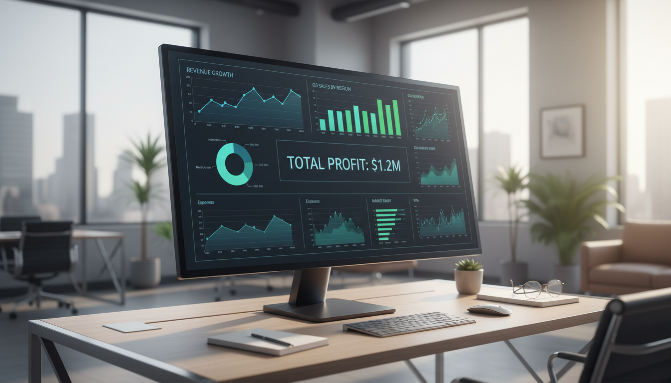
Once the automation engine is cleaning and structuring your data, the final step is selecting the visualization layer. For a daily performance dashboard for small business, the choice usually falls between Google Looker Studio, Microsoft Power BI, or Tableau. Each serves a specific organizational profile:
Tool | Best For | Primary Advantage |
|---|---|---|
Google Looker Studio | Google Workspace Users | Free, easy sharing, and fast setup. |
Microsoft Power BI | Office 365 Environments | Deep integration with Excel and robust data modeling. |
Tableau | Data-Heavy Organizations | Superior visuals and handling of massive datasets. |
However, the specific software matters far less than the integrity of the pipeline behind it. A beautiful chart built on a manual spreadsheet export is still prone to the same failures mentioned earlier. The priority should be streamlining operations by selecting a tool that handles live API connections rather than static file uploads.
Focus on cloud-native platforms that offer ease of access for a distributed workforce. This ensures that as you are building dedicated offshore teams, those members can monitor data quality and update reports in real time from any location. Choose a platform that allows for granular permissions, enabling you to scale the number of viewers without compromising data security or incurring prohibitive per-seat licensing costs as your team grows.
Leveraging Offshore Talent to Maintain Data Integrity

A visual layer is only as reliable as the data pipeline supporting it. While AI agents are highly efficient at streamlining operations by processing high volumes of data, they are not infallible. API documentation changes, source software updates its export schema, and occasionally, manual entries at the source are so irregular they bypass standard logic. This is where building dedicated offshore teams becomes a critical component of a resilient daily performance dashboard for small business.
In the Greater Toronto Area, hiring a full-time data analyst to manage these systems can cost upwards of $100,000 per year plus benefits; a prohibitive expense for many mid-sized firms. By leveraging lean offshore talent, you secure a dedicated resource to oversee data integrity and handle manual exceptions for a fraction of that cost. This individual serves as the human in the loop, verifying that the automated reports remain accurate every morning before your local team logs in. They manage the edge cases that AI might misinterpret, ensuring the dashboard never breaks due to a technical glitch or a sudden change in a third-party data source.
This hybrid model provides the enterprise-level reliability of a large corporation with the cost structure of a lean organization. It transforms the reporting process from a fragile technical project into a robust business asset. Instead of your local management team spending time troubleshooting why a chart is not updating, an offshore specialist has already identified and resolved the issue during their shift. This proactive maintenance ensures your data stays clean, your costs stay low, and your focus stays on high-level strategy.
The ROI of Real Time Insights in the Toronto Market
In the high-stakes Toronto market, where operational costs and labor rates are among the highest in Canada, the return on investment for real time visibility is immediate. Localized businesses across Ontario must navigate significant seasonal fluctuations, from the winter retail surge to summer peaks in professional services. Relying on monthly reports means you are often reacting to market shifts that have already passed. A daily performance dashboard for small business allows a firm to monitor labor costs against project milestones every 24 hours, ensuring that margins do not erode due to inefficiencies that go unnoticed for weeks.
Consider a mid-sized professional services firm in the GTA that currently dedicates three hours every morning to manual data reconciliation. By streamlining operations through automated data flows, they reclaim 15 hours of high-value leadership time per week. Over a year, this equates to over 700 hours redirected toward client acquisition and strategic growth. Beyond time savings, these insights drive client retention; by seeing a dip in engagement metrics in real time, the firm can intervene before a client relationship is jeopardized. Combining this technical speed with the cost-efficiency of building dedicated offshore teams creates a competitive advantage that manual, locally-managed processes simply cannot match.
Common Pitfalls to Avoid When Scaling Your Data Operations
A daily performance dashboard for small business is only valuable if it triggers immediate action. One frequent mistake is over-complicating the visual interface; if a chart requires a manual to interpret, the automation has failed. Complexity often hides inefficiencies in streamlining operations rather than solving them.
Additionally, scaling often leads to lax data permissions. Failing to restrict access to sensitive financial metrics can create internal friction or security risks. Lastly, dashboards fail when teams are not trained on how to respond to the data. By building dedicated offshore teams, you ensure a specialist manages these access controls and maintains the SOPs that turn data into measurable results, preventing your reporting tools from becoming passive ornaments.